Avalonia入门与实战 一、Avalonia 框架概述 1、简介 官方文档
Avalonia 是一个基于 .NET 和 Skia 的开源、跨平台 UI 框架,支持 Windows、Linux、macOS、iOS、Android 和 WebAssembly。Skia 是一个基于 C++ 的开源 2D 渲染引擎,Avalonia 通过 Skia 自绘 UI 控件,保证在全平台具有一致的观感。
Avalonia是一个现代化的、跨平台的UI框架,基于.NET平台开发。它的设计灵感来源于WPF(Windows Presentation Foundation),但unlike WPF,Avalonia不仅限于Windows平台,还可以在Linux、macOS等多个操作系统上运行。这种跨平台特性使得Avalonia成为开发桌面应用程序的理想选择,特别是在信创环境下,where国产操作系统的适配devient至关重要。
Mono是一个开源的.NET Framework兼容的运行时环境,它使得.NET代码可以在非Windows平台上运行
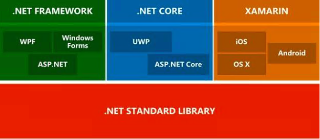
这张图展示了Avalonia如何通过不同的运行时环境(Core CLR和Mono Runtime)和图形引擎(Skia)来实现跨多个平台的UI开发
Mono是Xamarin,后来被微软收购了,所以xamarin和Avalonia用的都是Mono Runtime实现跨平台
2、为什么选择 Avalonia? C#生态大致如下
2.1、跨平台 涵盖桌面端、移动端、浏览器
跨多个平台共享 UI、布局和设计
相比于WPF跨平台 部分开源,但核心仍由微软控制
相比于MAUI,MAUI 采用原生控件映射的方式实现跨平台,单个平台缺少的控件在所有平台上都不可用,所以自带控件很少。跨平台方案中桌面端使用Avalonia,移动端使用MAUI
2.2、开源性 Avalonia 是一个活跃 的开源项目,拥有一个庞大 的开发社区(数十万)
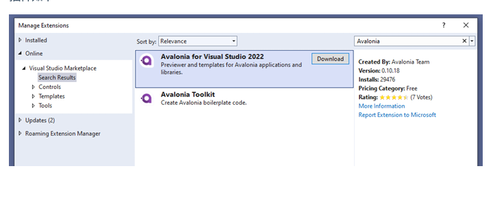
二、开发环境搭建 1、开发工具选择 Rider 非商用完全免费
安装AvaloniaRider插件,实现实时预览
visual studio
插件如下
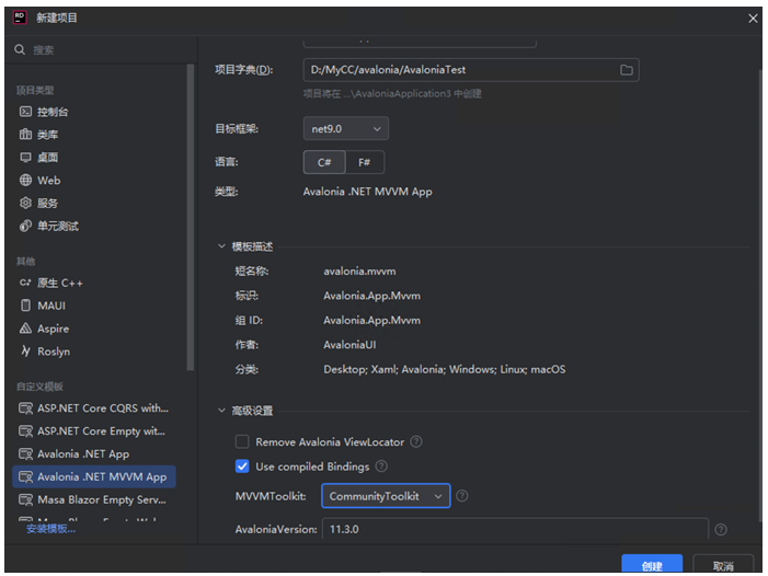
2、项目初始化 1、安装模板
1 dotnet new install Avalonia.Templates
Avalonia .NET App: 使用 code-behind 而不是 MVVM 的桌面应用程序(Windows、macOS 和 Linux)模板。Avalonia .NET MVVM App: 使用 MVVM(默认使用 RxUI)的桌面应用程序(Windows、macOS 和 Linux)模板。Avalonia Cross-Platform Application: 适用于所有受支持平台(Windows、macOS、Linux、iOS、Android 和 WASM)的模板。此模板需要额外的工作负载。
2、新建项目 选择Avalonia .NET MVVM App
3、项目结构 MyFirstAvaloniaApp/
View Locator 是 Avalonia 中的视图导航工具,负责将 ViewModel 映射至对应 View,实际应用中可自己实现。
三、核心概念与组件 1、XAML语法基础 XAML是Avalonia用于描述用户界面的标记语言。可以将XAML理解为一种声明式的UI描述方式,类似于HTML之于Web开发。
当使用 XAML 描述用户界面时,Avalonia 将这些 XAML 文件解析成 UI 元素树,并使用 SkiaSharp 来将这些 UI 元素绘制到屏幕上。
2、常用布局组件
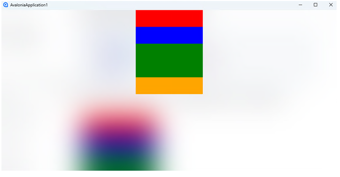
①StackPanel 堆栈面板
1
2
3
4
5
6
7
<StackPanel Width="200"> <!--<Rectangle> 是一个用于绘制矩形形状的控件--> <Rectangle Fill="Red" Height="50"/> <Rectangle Fill="Blue" Height="50"/> <Rectangle Fill="Green" Height="100"/> <Rectangle Fill="Orange" Height="50"/> </StackPanel>
效果图如下:
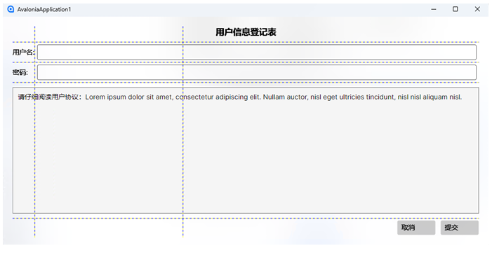
②Grid 网格布局 控件非常适用于按列和行排列子控件
1
2
3
4
5
6
7
8
9
10
11
12
13
14
15
16
17
18
19
20
21
22
23
24
25
26
27
28
29
30
31
32
33
34
35
36
37
38
39
40
41
42
43
44
45
46
47
48
49
50
51
52
53
54
55
<!-- 1. 定义列 --> <Grid.ColumnDefinitions> <ColumnDefinition Width="Auto"/> <!-- 第1列:自动宽度(适应内容) --> <ColumnDefinition Width="*"/> <!-- 第2列:占用剩余空间 --> <ColumnDefinition Width="2*"/> <!-- 第3列:宽度是第2列的2倍 --> </Grid.ColumnDefinitions> <!-- 2. 定义行 --> <Grid.RowDefinitions> <RowDefinition Height="Auto"/> <!-- 第1行:自动高度 --> <RowDefinition Height="Auto"/> <!-- 第2行:自动高度 --> <RowDefinition Height="Auto"/> <!-- 第3行:自动高度 --> <RowDefinition Height="*"/> <!-- 第4行:占用剩余空间 --> <RowDefinition Height="40"/> <!-- 第5行:固定高度40像素 --> </Grid.RowDefinitions> <!-- 3. 添加控件到网格单元格 --> <!-- 标题(跨3列) --> <TextBlock Text="用户信息登记表" Grid.Column="0" Grid.ColumnSpan="3" FontSize="18" FontWeight="Bold" HorizontalAlignment="Center" Margin="0,0,0,10"/> <!-- 用户名行 --> <TextBlock Text="用户名:" Grid.Row="1" Grid.Column="0" VerticalAlignment="Center"/> <TextBox Grid.Row="1" Grid.Column="1" Grid.ColumnSpan="2" Margin="5" /> <!-- 密码行 --> <TextBlock Text="密码:" Grid.Row="2" Grid.Column="0" VerticalAlignment="Center"/> <TextBox Grid.Row="2" Grid.Column="1" Grid.ColumnSpan="2" Margin="5" /> <!-- 用户协议(跨3列) --> <Border Background="#FFF5F5F5" BorderBrush="Gray" BorderThickness="1" Grid.Row="3" Grid.Column="0" Grid.ColumnSpan="3" Margin="0,10" Padding="10"> <TextBlock TextWrapping="Wrap"> 请仔细阅读用户协议:Lorem ipsum dolor sit amet, consectetur adipiscing elit. Nullam auctor, nisl eget ultricies tincidunt, nisl nisl aliquam nisl. </TextBlock> </Border> <!-- 按钮行 --> <StackPanel Orientation="Horizontal" HorizontalAlignment="Right" Grid.Row="4" Grid.Column="2"> <Button Content="取消" Margin="0,0,10,0" Width="80"/> <Button Content="提交" Width="80"/> </StackPanel> </Grid>
效果图如下:
①Button 按钮
示例:
1
2
3
4
<StackPanel Margin="20"> <Button Click="ClickHandler" HorizontalAlignment="Center">Press Me!</Button> <TextBlock Margin="0 50" x:Name="message" HorizontalAlignment="Center">Ready...</TextBlock> </StackPanel>
1
2
3
4
public void ClickHandler(object sender, RoutedEventArgs args) { message.Text = "Button clicked!"; }
效果图如下:
②@TextBlock 文本块 @TextBox 文本框
示例:
1
2
3
4
5
6
7
8
<StackPanel Margin="20"> <TextBlock Margin="0 5" >Name:</TextBlock> <TextBox Watermark="Enter your name"/> <TextBlock Margin="0 5" >Password:</TextBlock> <TextBox PasswordChar="*" Watermark="Enter your password"/> <TextBlock Margin="0 15 0 5">Notes:</TextBlock> <TextBox Height="100" AcceptsReturn="True" TextWrapping="Wrap"/> </StackPanel>
效果图如下:
数据展示控件 (ListBox, DataGrid等)
①ListBox 列表框 DockPanel 边缘布局面板
边缘布局面板(Dock Panel)控件可以沿着指定的“停靠边缘”(顶部、底部、左侧和右侧)排列其子控件,最后一个子控件填充剩余的空间
1
2
3
4
5
6
7
8
9
10
11
12
13
<DockPanel Margin="20"> <TextBlock Margin="0 5" DockPanel.Dock="Top">选择一个动物:</TextBlock> <ListBox x:Name="animals"> <ListBox.ItemTemplate> <DataTemplate> <Border BorderBrush="Blue" BorderThickness="1" CornerRadius="4" Padding="4"> <TextBlock Text="{Binding}"/> </Border> </DataTemplate> </ListBox.ItemTemplate> </ListBox> </DockPanel>
1
2
3
4
5
6
7
public MainWindow() { InitializeComponent(); animals.ItemsSource = new string[] {"cat", "camel", "cow", "chameleon", "mouse", "lion", "zebra" } .OrderBy(x => x); }
效果如下:
②DataGrid 数据表格
1、安装Avalonia.Controls.DataGrid 包
2、引入数据表格样式
1
2
3
4
<Application.Styles> <FluentTheme /> <StyleInclude Source="avares://Avalonia.Controls.DataGrid/Themes/Fluent.xaml"/> </Application.Styles>
1
2
3
4
5
6
7
8
9
10
11
public class Person { public string FirstName { get; set; } public string LastName { get; set; } public Person(string firstName , string lastName) { FirstName = firstName; LastName = lastName; } }
1
2
3
4
5
6
7
8
9
10
11
12
13
14
15
16
17
public partial class MainWindowViewModel : ViewModelBase { public string Greeting { get; } = "Welcome to Avalonia!"; public ObservableCollection<Person> People { get; } public MainWindowViewModel() { var people = new List<Person> { new Person("Neil", "Armstrong"), new Person("Buzz", "Lightyear"), new Person("James", "Kirk") }; People = new ObservableCollection<Person>(people); } }
1
2
3
4
5
<DataGrid Margin="20" ItemsSource="{Binding People}" AutoGenerateColumns="True" IsReadOnly="True" GridLinesVisibility="All" BorderThickness="1" BorderBrush="Gray"> </DataGrid>
如果属性或集合实现了通知接口(如 INotifyPropertyChanged/INotifyCollectionChanged),框架会订阅这些通知事件。当数据变化时,UI 自动刷新,无需手动调用 UpdateLayout() 或 Refresh()。
效果如下:
3、数据绑定 INotifyPropertyChanged 是 .NET 提供的一个接口,类可以实现该接口以表示属性已更改其值。这在数据绑定场景中特别有用,当绑定的数据发生变化时,可以自动更新用户界面(UI)。
INotifyPropertyChanged 接口具有一个事件成员,即 PropertyChanged。当属性的值更改时,对象会引发 PropertyChanged 事件,以通知任何已绑定的元素属性已更改。
原生绑定
1
2
3
4
5
6
7
8
9
10
11
12
13
14
15
16
17
18
19
20
21
public class MyViewModel : INotifyPropertyChanged { private string _name; public string Name { get { return _name; } set { _name = value ; OnPropertyChanged(nameof (Name)); } } public event PropertyChangedEventHandler PropertyChanged; protected virtual void OnPropertyChanged (string propertyName { PropertyChanged?.Invoke(this , new PropertyChangedEventArgs(propertyName)); } }
在此代码中,每当将 Name 属性设置为新值时,将调用 OnPropertyChanged 方法,该方法会引发 PropertyChanged 事件。与此属性绑定的任何用户界面元素将会更新以反映新值。
MVVM Toolkit 全称CommunityToolkit.Mvvm
1
2
3
4
5
6
7
using CommunityToolkit.Mvvm.ComponentModel;public partial class MyViewModel : ObservableObject { [ObservableProperty ] private string _name; }
示例:
1
2
3
4
5
public partial class MainWindowViewModel : ViewModelBase { [ObservableProperty ] private string _name = "初始值" ; }
MainWindow.axaml:
1
2
3
4
5
<!--OneWay/OneTime--> <StackPanel> <TextBox Text="{Binding Name, Mode=TwoWay}"/> <TextBlock Text="{Binding Name}"/> </StackPanel>
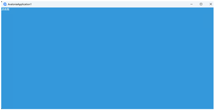
4、样式与资源 Avalonia的样式系统允许你自定义应用程序的外观。你可以在App.axaml中定义全局样式,或者在控件中定义局部样式。
全局样式示例:
1 2 3 4 5 6 7 8 9 <Application.Styles > <Style Selector ="Button" > <Setter Property ="Background" Value ="#3498db" /> <Setter Property ="Foreground" Value ="White" /> </Style > </Application.Styles > 其他地方使用 <Button Content ="点击我" />
效果如下:
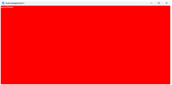
局部样式示例(直接覆盖全局样式):
1 2 3 4 5 6 7 <Button Content ="Special Button" > <Button.Styles > <Style Selector ="Button" > <Setter Property ="Background" Value ="Red" /> </Style > </Button.Styles > </Button >
效果如下:
四、实战
音乐商店桌面应用程序
五、跨平台部署 1、Windows部署 1 dotnet publish -c Release -r win-x64 --self-contained true
2、Linux部署 1 dotnet publish -c Release -r osx-x64 --self-contained true
3、MacOS部署 1 dotnet publish -c Release -r linux-x64 --self-contained true


 wechat